UK Punk and Skate Style: A Working Guide
UK skate-punk has a coherent visual language that has held together across nearly fifty years. The clothes change very little decade to decade. The graphic design tools change (Letraset, then Photoshop, then Procreate) but the output looks consistent. This guide breaks down the working components and where they came from.
The uniform
The UK skate-punk wardrobe is small and deliberate. It revolves around a handful of items, all of which can be assembled from charity shops, market stalls, or end-of-line bins:
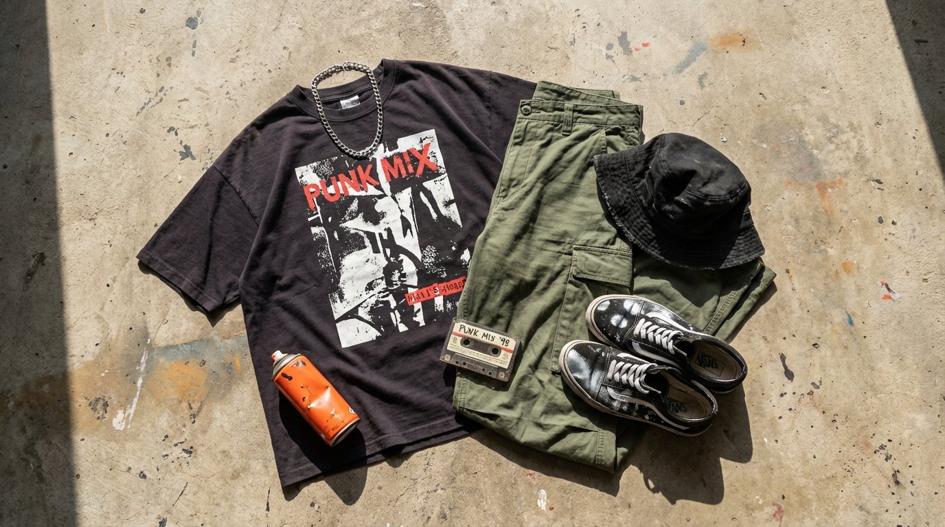
- Bucket hat. Black, off-white, or two-tone checkerboard. The defining piece for at least three different waves of British music since the late 80s. Equally common in 90s Madchester, 2010s grime, and 2020s skate-punk.
- Oversized graphic tee. Screen-printed punk-style collage, a bold word, or a cheap promo shirt picked up at a show. Always one or two sizes too big.
- Baggy trousers. Cargos, loose jeans, occasionally tracksuit bottoms. Tight skinnies are a 2000s indie hangover and have not aged well in this scene.
- Skate sneakers with the wear on. Vans, Converse, or any equivalent. Spray paint stains, scuffed toes, melted laces. The deliberately worn look reads as authentic.
- Silver chain or rope necklace. Single piece, usually non-religious. Borrowed from late 90s skate-rap.
- An optional second layer. Oversized checkered shirt, windbreaker, or charity-shop blazer. Worn open.
What is absent from the list matters too. No designer streetwear logos. No deliberately expensive piece. No "fit pic" attempt at a polished outfit. The goal is "thrown on to go skating", which is a harder look to fake than it sounds.
The graphic design lineage
Three main visual ancestors hold the UK skate-punk graphic identity together.
Jamie Reid's late-70s Sex Pistols artwork. The cut-and-paste ransom-note typography, the high-contrast collage, the safety-orange and yellow colour palette. Almost every modern UK punk show flyer is a great-grandchild of this work.
The 80s Crass collective design bloc. The use of stencil typography, military-surplus aesthetics, the political-graphic-design-as-art-piece approach. This is where the modern UK DIY zine look gets its rougher edge.
2-Tone graphics from 1979-1981. The black-and-white-checkerboard motif, the suit-and-tie ska-mod look, the Walt Jabsco line drawing. All recycled into 90s UK ska-punk visuals and still cropping up in 2020s merch.
Layered on top of those, the post-2000 generation added short-form skate-video grammar, VHS-grain filters, and the on-screen-typography aesthetic familiar from skate-zine print.
Colour palette
Limited and consistent. Ink black, paper cream or off-white, safety orange, occasional safety yellow. Black-and-white-only versions for hardcore-leaning material. Two-tone (black and white only, alternating) for the ska-punk side.
The palette photocopies well, screen-prints cleanly, and translates to spray paint stencils. That is not an aesthetic accident. It is a working printer's palette, designed for the practical reality of small-run merch and zine production.
Typography
Three typefaces (or close cousins) appear over and over: a tall condensed sans-serif (Anton, Oswald, Impact - punk poster face), a typewriter font (Special Elite, American Typewriter - zine and tagline face), and a clean modern body face (Inter, Helvetica, Univers - long-form text). The design moves of cutting type out of magazine pages, mixing fonts deliberately, and using hand-drawn lettering between the type are all directly inherited from 70s and 80s zine practice.
UK skate-punk graphic design is best understood as a working printer's craft. Cheap to reproduce, fast to set, robust under bad lighting at a show.
Video and motion grammar
The video side of the aesthetic is at least as consistent as the still side. UK skate-punk videos tend toward:
- Short shots, fast cuts, hard edits on the beat. Skate-edit grammar.
- Visible film or VHS grain. Sometimes a real camcorder, often a digital filter.
- Suburban locations: alleyways, skateparks, supermarket car parks, train station underpasses.
- Hand-drawn or roughly-set on-screen typography over the footage.
- Cameos by friends and crew rather than professional dancers or extras.
Live show staging
On the small UK punk circuit the staging is deliberately under-produced: crowd-level lighting, no backdrop more elaborate than a spray-painted bedsheet, the band's logo applied with stencils to a kick drum and an amp. Headliner-tier shows scale this up but rarely break the visual rules. The point is to keep the aesthetic readable from the back of a 200-cap room.
Why the aesthetic has lasted
Three reasons. First, the practical print constraints (cheap reproduction, two-colour palettes, stencil-friendly type) have not changed - the same constraints produce the same solutions in 1977 and in 2026. Second, the visual identity is genuinely close to what the audience actually wears, so it does not read as costume. Third, the scene refuses to chase fashion cycles, which means oversized tees and bucket hats stay on regardless of whether the broader market currently considers them in or out.
For where this visual culture actually lives geographically, see the scene page. For the records that carry these visual cues on their sleeves, see the albums page.